

What Role Does Color Psychology Play in Branding?
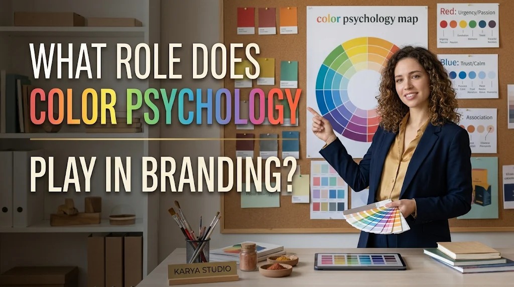
Color psychology plays an important role in how customers perceive and recognize a brand. Colors can create visual associations, communicate emotions, and influence the first impression people form about a business. For this reason, companies carefully select colors for their logos, packaging, websites, advertisements, and other marketing materials.
In branding, color is not simply a decorative element. It helps communicate a company's personality, values, and market positioning. When businesses use colors strategically and consistently, they can create a recognizable visual identity and build stronger connections with their target audiences.
UNDERSTANDING COLOR PSYCHOLOGY IN BRANDING
Color psychology refers to the study of how colors can influence human perception, emotions, and behavior. In branding, it helps businesses understand the possible associations customers may develop when they see particular colors.
For example, blue is often associated with trust and professionalism, while green can suggest nature, growth, or environmental awareness. However, these associations are not universal. Personal experiences, cultural backgrounds, product categories, and individual preferences can influence how customers interpret colors.
HOW COLORS COMMUNICATE BRAND PERSONALITY
Colors help businesses express their personality without relying entirely on written messages. A company that wants to appear energetic may choose bright and vibrant colors, while a business that emphasizes simplicity may prefer neutral shades.
These choices should reflect the characteristics a brand wants customers to remember. For example, a children's product company might use playful color combinations, while a luxury business may choose darker or more restrained tones. Matching colors with brand personality creates a more coherent visual presentation.
THE PSYCHOLOGICAL MEANINGS OF COMMON BRAND COLORS
Different colors can create different impressions depending on their context and usage. Understanding common color associations can help businesses develop a visual identity that supports their marketing objectives.
- Red: Often associated with energy, excitement, passion, and urgency. It is frequently used by brands that want to create a bold and noticeable appearance.
- Blue: Commonly connected with trust, stability, and professionalism. It is popular among businesses that want to communicate reliability.
- Green: Often represents nature, health, growth, and sustainability. It is frequently used by businesses related to food, agriculture, and environmental products.
- Yellow: Can communicate optimism, warmth, and happiness. It helps create a bright and attention-grabbing visual impression.
- Black: Often associated with elegance, sophistication, authority, and simplicity. It is commonly used in premium product branding.
- Purple: Can suggest creativity, luxury, imagination, or individuality. It may help brands establish a distinctive personality.
- Orange: Often communicates enthusiasm, friendliness, and energy. It can create a welcoming and approachable impression.
These meanings should be treated as general associations rather than fixed psychological rules. Businesses need to consider their target audience and industry before choosing a color.
CREATING STRONGER BRAND RECOGNITION
Consistent color usage helps customers recognize a brand across different communication channels. When people repeatedly encounter the same color combinations in logos, packaging, advertisements, and social media content, they may begin associating those colors with a particular business.
This familiarity can make a brand easier to identify, even when customers do not immediately read its name. A distinctive color palette can also help products stand out among competitors. Over time, consistent application strengthens the connection between visual elements and brand identity.
INFLUENCING CUSTOMER PERCEPTION AND PURCHASING DECISIONS
Color can influence the way customers evaluate products and marketing messages. A suitable color combination may make a product appear more appealing, premium, affordable, natural, or modern.
For example, a skincare product with soft neutral colors may communicate simplicity and elegance, while a brightly colored snack package may suggest a fun and energetic experience. These impressions can affect initial interest, although purchasing decisions also depend on price, quality, product benefits, reputation, and customer needs.
USING COLOR TO DIFFERENTIATE A BRAND FROM COMPETITORS
In competitive markets, businesses need visual characteristics that make their products recognizable. Choosing a distinctive color palette can help a company establish a unique appearance within its industry.
Before selecting brand colors, businesses should examine the visual styles commonly used by competitors. They can then identify opportunities to create a different but relevant presentation. However, differentiation should not come at the expense of readability or consistency with the product's actual identity.
MAINTAINING COLOR CONSISTENCY ACROSS MARKETING CHANNELS
A brand should use its selected colors consistently across websites, social media, advertisements, packaging, business cards, and other promotional materials. This creates a unified appearance and helps customers connect different interactions with the same company.
Businesses can establish a color palette containing primary, secondary, and supporting colors. Brand guidelines should also specify how these colors are used in different situations. This prevents unnecessary variations and helps marketing teams maintain a recognizable visual identity.
CONSIDERING CULTURAL DIFFERENCES IN COLOR MEANINGS
Color associations can differ across countries, communities, and cultural traditions. A color that communicates celebration in one culture may have a different meaning in another. Businesses targeting international or culturally diverse audiences should consider these differences before finalizing their visual identity.
Market research can help companies understand how their target customers interpret particular colors. Testing different combinations through surveys or customer feedback can also reveal whether a design communicates the intended message. This approach helps businesses avoid assumptions based only on general color meanings.
CHOOSING COLORS THAT SUPPORT BRAND ACCESSIBILITY
An effective color palette should be attractive while remaining accessible to different customers. Businesses need to consider sufficient contrast between text and backgrounds so information can be read comfortably.
Relying only on color to communicate important information can also create difficulties for people with color vision deficiencies. Using labels, icons, patterns, and clear typography alongside colors makes marketing materials easier to understand. Accessibility should be considered throughout the branding process rather than added at the end.
HOW BUSINESSES CAN DEVELOP AN EFFECTIVE BRAND COLOR PALETTE
Businesses should begin by identifying their brand values, personality, target audience, and market position. These factors provide a foundation for selecting colors that support the intended identity.
After choosing potential colors, companies can test them in practical applications such as logos, product packaging, websites, and advertisements. They should evaluate whether the combinations are recognizable, readable, and appropriate for the product category. Once the palette is finalized, clear guidelines can help maintain consistency across all brand materials.
CONCLUSION
Color psychology plays an important role in branding by influencing visual perception, communicating brand personality, and supporting customer recognition. The right color palette can help businesses create a distinctive identity and communicate their values more effectively.
However, color choices should not rely on general psychological associations alone. Businesses need to consider cultural differences, target audience preferences, accessibility, and market positioning. By combining thoughtful color selection with consistent application, companies can create a recognizable and meaningful brand identity.
Recent Posts

Bagaimana Sistem SKS pada Program Kuliah... 22.11.2026/35 View

How Does Technology Make Daily Evaluation... 21.11.2026/69 View

Apa Strategi Menghadapi Kesenjangan antara Kompetensi... 21.11.2026/69 View

Mengapa Inventaris Aset Penting bagi Kelancaran... 21.11.2026/67 View

When Should Musicians Join a Record... 21.11.2026/68 View
